


Quand une image vaut mille mots… sans mille maux!
Par Anik Lessard-Routhier
Un dossier réalisé conjointement par L’École branchée et Carrefour éducation
Il existe des tonnes de façons de faciliter l’apprentissage des élèves. Si, traditionnellement, la lecture de manuels constituait la méthode de base pour s’approprier l’information, les nouvelles technologies permettent maintenant de rendre les contenus plus séduisants, certes, mais surtout plus faciles à assimiler et à retenir. Dans ce contexte, l’infographie éducative semble une solution à ne pas négliger en classe!
- Quelles sont les bases de cette technique de transmission de contenu?
- Avec quels outils peut-on réaliser facilement des infographies éducatives?
- Dans quels contextes celles-ci vous permettront-elles, à vous et à vos élèves, d’en retirer les plus grands bénéfices?
Voilà certaines questions auxquelles répondra ce dossier.
SOMMAIRE DU DOSSIER
1. L’infographie éducative : un outil visuel pour apprendre
– Les avantages de l’infographie en classe
2. Les caractéristiques d’une infographie réussie
3. Fabriquer une infographie : comment faire?
– Logiciels
– Outils en ligne
– D’autres outils pour l’apprentissage visuel
4. L’infographie au service de l’enseignant
– Pour véhiculer de l’information
– Pour planifier son enseignement
– Pour évaluer les élèves
5. L’infographie au service de l’élève
– Pour encadrer les travaux
– Pour faciliter certaines tâches et apprentissages
L’infographie éducative : Un outil visuel pour apprendre
Aux premiers abords, le terme « infographie » peut sembler rébarbatif ou laisser sous-entendre la nécessité d’habiletés techniques complexes. N’ayez crainte! Appliquée à l’éducation, l’infographie constitue une méthode d’apprentissage des plus conviviales et efficaces.
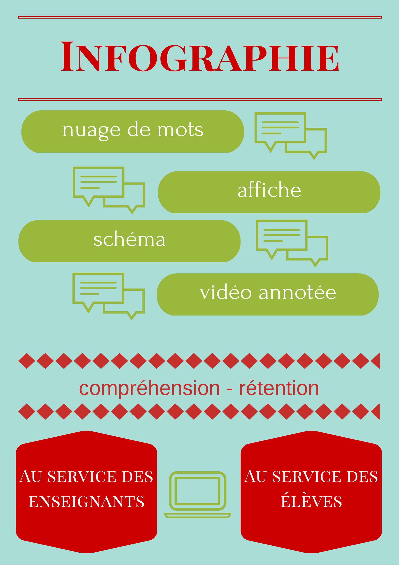
Dans les faits, on pourrait définir l’infographie comme un outil de synthèse pour s’approprier et transmettre divers contenus de façon visuelle. Il s’agit donc en quelque sorte d’une présentation (pensez, par exemple, à une affiche) qui regroupe en un seul document et un seul coup d’œil, toute l’information que vous souhaitez transmettre. Cela a évidemment comme principal avantage de faciliter la compréhension et la rétention du contenu chez ceux qui utilisent ces infographies, que ce soit à titre de concepteur ou de récepteur.
Afin de vous forger une idée plus concrète de ce en quoi peut consister une infographie et de ses principaux usages et avantages, jetez un coup d’œil à celle qui suit. Vous ferez d’ailleurs d’une pierre deux coups, puisque cette infographie, justement, résume ce qu’il y a à savoir à leur sujet. Vous constaterez d’ailleurs qu’en lisant la section suivante de ce dossier, vous obtiendrez les mêmes informations que si vous aviez seulement parcouru cette infographie, mais en plus de temps.
Voilà l’occasion de comparer comment vous percevez les informations. Aurez-vous mieux retenu ce que vous avez perçu grâce à l’infographie ou ce que vous aurez lu dans ce dossier? Préférez-vous associer les deux méthodes, c’est-à-dire lecture de textes complets + infographie de synthèse? Laquelle de ces méthodes vous semble devoir être présentée en premier? Vous comprendrez qu’il n’y a pas de bonnes ni de mauvaises réponses à ces questions, tout dépend des goûts et de la manière d’apprendre de chacun.
Les avantages de l’infographie en classe
Que vous soyez celui qui réalise les infographies ou que vous en confiez la tâche à vos élèves en devoirs, et quel que soit le contexte dans lequel vous les utilisez, ces présentations éducatives sauront vous séduire par leurs nombreux avantages, tant au plan cognitif que motivationnel.
Esprit d’analyse
En premier lieu, cette méthode favorise le développement de l’esprit d’analyse. En effet, afin de créer une infographie, il faut d’abord bien s’approprier le contenu. L’enseignant qui en créé sera donc plus à même de transmettre sa matière, et l’élève aura quant à lui mieux compris ce qu’il véhicule dans ses propres travaux, plutôt que de recopier des phrases sans aucune signification ni lien réel. L’aspect visuel de ce type d’outil nécessite en effet une réflexion préalable sur la meilleure manière de présenter son contenu. Un choix sera donc établi afin de déterminer ce qui est essentiel à transmettre, en opposition au contenu secondaire. Par ailleurs, des liens entre les contenus devront être établis, ce qui oblige le créateur à bien structurer les données. Tous ces efforts mentaux et cette appropriation personnelle des informations diminuent grandement les risques de plagiat dans la réalisation de travaux et rehaussent la compréhension véritable des apprenants.
Motivation liée à l’utilisation des TIC
En outre, la motivation des élèves est sollicitée lorsque des travaux sont exigés sous forme d’infographies, puisque cette façon de faire implique les TIC. L’esthétisme et la créativité sont également au rendez-vous, ce qui risque d’amuser les élèves et de plaire à ceux qui ont une personnalité artistique plus développée. De plus, le partage de ces œuvres s’avère intéressant : en les publiant sur le Web ou en les projetant sur le TNI, par exemple, vous rendez les élèves fiers de leurs réalisations.
Alliance entre l’image et les mots pour favoriser l’assimilation
Évidemment, une fois mises au monde et partagées, une bonne infographie peut rendre la matière plus facile à assimiler. En ce sens, elles constituent un excellent outil de préparation aux examens, puisque les élèves n’ont qu’à les réviser pour vérifier s’ils ont tout compris, ce qui peut d’ailleurs être effectué avec le soutien des parents, qui pourront eux aussi consulter les infographies. En outre, l’alliance entre le visuel et les mots favorise la rétention à court et à long terme. Que demander de mieux?
Voyons maintenant un aperçu des caractéristiques d’une infographie réussie.
Les caractéristiques d’une infographie réussie
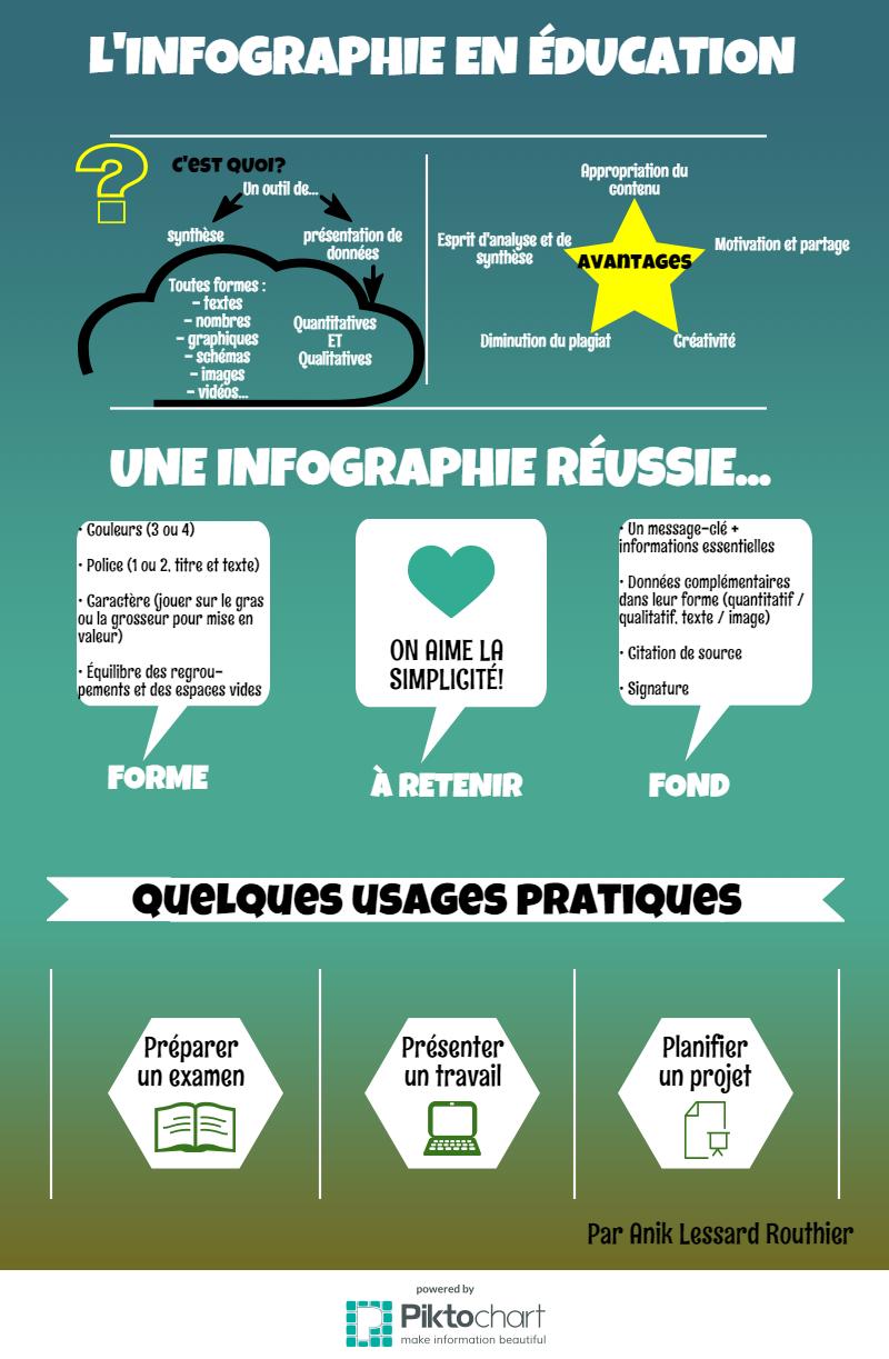
Avant de concevoir votre première infographie (nous vous suggérons d’ailleurs quelques outils en ligne dans une autre partie de ce dossier), prenez connaissance des éléments qui feront de vos créations de véritables réussites! Une infographie bien réfléchie pourra faire toute la différence chez les élèves.
Songez d’abord au message-clé que vous souhaitez véhiculer. Ce dernier sera couplé à quelques informations essentielles. Évidemment, lorsque vous enseignez, vos paroles et exemples complèteront oralement l’infographie et viendront y greffer des renseignements non négligeables, mais secondaires.
Les données que vous voulez faire connaître peuvent être de tout acabit, tant quantitatif que qualitatif. En outre, la combinaison de ces deux types rend vos œuvres encore plus complètes. D’ailleurs, la forme que prendront les données a tout intérêt à varier : textes, données chiffrées, graphiques, diagrammes, schémas (voyez à ce sujet notre dossier sur les cartes mentales), images et parfois même vidéos. L’idée est de faire en sorte que les données apparaissent complémentaires dans leur forme, de manière à susciter davantage l’attention et l’intérêt des élèves.
La mise en page, quant à elle, se doit d’être conviviale, c’est-à-dire aérée et facile à comprendre. Les liens entre les informations seront évidents et les mots-clés utilisés, évocateurs, ce qui rendra leur rétention plus aisée. Bien que cela puisse paraître aller de soi, une infographie réussie comprend la citation de sources et la signature de celui ou de celle qui l’a réalisée.
En ce qui concerne la forme de votre infographie, visez le minimalisme. Votre création vous prendra moins de temps à réaliser, et en plus, son impact sera amplifié. Sur le plan des couleurs, trois ou quatre apparaissent suffisantes. N’hésitez pas à opter pour des dégradés ou des couleurs de tons semblables ou complémentaires. Pour ce qui est des polices de caractère, vous avez avantage à les limiter à une ou deux, par exemple en distinguant les titres et sous-titres des textes proprement dits. Utilisez plutôt les options des caractères pour mettre en valeur certains éléments, en ajoutant du gras, en surlignant ou soulignant ou en modifiant la taille des lettres. Finalement, pensez à équilibrer les regroupements et les espaces vides.
Prêt à faire un essai? Votre démarche commence dès maintenant!
Fabriquer une infographie : comment faire?
Entrons maintenant dans la partie pratique. Pour réaliser une infographie, vous pouvez utiliser des logiciels dont vous disposez déjà, mais vous aimerez peut-être aussi découvrir certaines applications en ligne gratuites qui se spécialisent en infographie facile.
Logiciels
Parmi les logiciels bien connus qui permettent la création d’infographies, vous pouvez opter pour PowerPoint (et enregistrer vos fichiers en format image, par exemple). Les logiciels plus perfectionnés comme Illustrator, Gimp ou Photoshop conviennent aussi. Si vous souhaitez créer des schémas, certains logiciels libres comme FreePlane et Xmind peuvent être téléchargés gratuitement (consultez notre dossier sur les cartes mentales pour en savoir plus). En outre, les logiciels de traitement de texte pourraient aussi permettre de fabriquer des infographies, mais ils s’avèrent habituellement un peu moins pratiques pour ce type de réalisations.
En choisissant des logiciels que vous possédez et maîtrisez déjà, vous gagnez un peu de temps, puisque vous n’avez pas à apprendre leur fonctionnement et qu’ils sont déjà installés sur votre ordinateur. Cela dit, quelques inconvénients demeurent. En effet, ces outils seront probablement moins conviviaux que ceux qui sont principalement destinés aux créations visuelles. De plus, le partage ou la publication sur le Web ne s’effectuent pas automatiquement.
Outils en ligne
Afin de pallier ces désavantages, sachez qu’il existe des outils en ligne gratuits spécialement dédiés à l’infographie. Parmi ceux-ci, notons :
- Piktochart
- Canva
- Infogr.am (payant après 10 infographies)
- Venngage (5 infographies gratuites)
J’ai testé certaines de ces applications afin de voir ce qu’une néophyte paresseuse en la matière comme moi (!) pouvait en retirer sans trop d’efforts. En effet, que vous songiez les utiliser pour votre enseignement ou que vous prévoyiez proposer cette activité à vos élèves, eux comme vous ne disposez pas de toute la vie pour comprendre les rouages de nouveaux outils technologiques. Ces derniers doivent donc pouvoir être utilisés facilement et permettre la réalisation d’infographies de qualité sans exiger trop de temps.
Je me suis donc amusée à utiliser Piktochart et Canva afin de les comparer. Voyez le résultat de ma comparaison dans cette infographie, créée avec Piktochart.
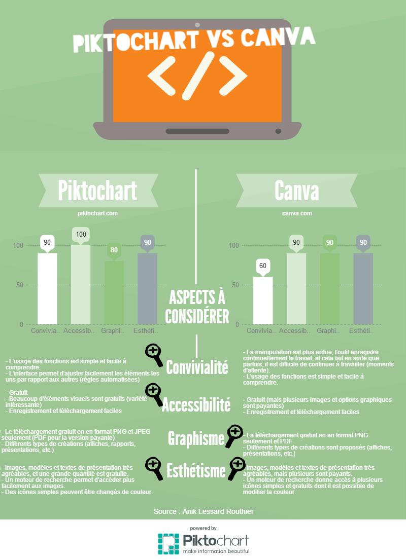
Bien que ma préférence personnelle aille à Picktochart, je vous recommande les deux outils. Les modèles visuels offerts de base varient, de même que le fonctionnement, et comme tous les goûts sont dans la nature, vous n’arriverez peut-être pas à la même conclusion que moi.
NOTE DE L’ÉDITEUR : Ce dossier ayant été rédigé en 2015, il faut noter que Canva a énormément évolué depuis et qu’il constitue un excellent choix pour les besoins éducatifs, permettant même la création simple de vidéo.
D’autres outils pour l’apprentissage visuel
De plus, sachez que certains sites Web offrent d’autres options pour réaliser des infographies « par la bande ». En fait, il s’agit ici d’infographies au sens plus large, c’est-à-dire des réalisations de nature visuelle, mais orientées vers un style de présentation précis. Voyez ce qu’il est, entre autres, possible de faire :
- Les schémas : les amateurs de cartes mentales ou heuristiques aimeront SpiderScribe. Vous pourrez y enregistrer vos créations et les partager. Consultez notre dossier sur les cartes mentales pour d’autres options en ligne ou à télécharger.
- Les nuages de mots: tous les mots-clés relatifs à un sujet peuvent s’amalgamer en un nuage évocateur. Le site Wordle vous permet d’y arriver en un rien de temps.
- Les présentations interactives: vous souhaitez une présentation plus attrayante que celles obtenues sur PowerPoint? Le site Prezi vous ravira. Vous pouvez créer des présentations interactives de toutes pièces, mais il est aussi bon de savoir que les usagers du site partagent des milliers de présentations que vous pouvez librement copier (les usagers en donnent le droit) et éditer à votre guise. Ainsi, si le modèle d’une présentation vous séduit, vous pouvez en conserver la forme tout en modifiant le contenu. En plus du texte, les présentations permettent l’intégration d’images et de vidéos.
- Les chronologies imagées: comme une image vaut mille mots, ajoutez-en à vos chronologies pour les rendre encore plus évocatrices. Cela s’avère possible avec des outils comme Timeline JS et Dipity.
- Les images interactives: sur une image de votre choix, ajoutez des éléments cliquables qui mèneront vers des vidéos ou des pages Web. C’est ce que permet Thinglink.
- Les vidéos éditées : surprenez vos élèves en leur présentant des vidéos de YouTube, sur lesquelles apparaîtront vos questions de compréhension ou même vos commentaires écrits ou audio. Grâce à EdPuzzle, vous y arriverez aisément. Vous pouvez même couper les vidéos qui vous semblent s’éterniser, ou dont une seule portion a retenu votre attention, et ainsi obtenir une version allégée. Amusez-vous même à apostropher vos élèves de temps à autre, par exemple : « Charles, est-ce que tu écoutes bien? » Rires et concentration garantis!
Comme vous le constatez, ces possibilités ne constituent que la pointe de l’iceberg. Maintenant que vous connaissez quelques outils vous permettant de mettre l’image au service de l’apprentissage, la prochaine section vous permettra de distinguer divers contextes d’utilisations pédagogiques, pour que vos horizons s’étendent encore plus loin…
L’infographie au service de l’enseignant
Voici quelques usages de l’infographie au service de l’enseignant.
Pour véhiculer de l’information
En créant vos infographies, vous pourrez présenter de l’information de manière efficace et structurée, qu’il s’agisse de la matière vue en classe ou du contenu d’une réunion de parents en début d’année. Évidemment, la présentation de vos créations convient tout à fait à un usage sur le TNI, que ce soit en guise de document unique ou à l’intérieur d’un diaporama. Lorsque vous présenterez vos infographies, vous pourrez les compléter à l’aide d’explications orales. En fournissant aussi une copie papier de vos réalisations à vos élèves, ces derniers pourront prendre des notes directement dessus, afin de mieux se les approprier.
Toutes les infographies de vos cours pourront d’ailleurs constituer un recueil que vous rendrez disponible sur papier à titre d’outil de référence. En partageant plutôt sur le Web, vous faites d’une pierre deux coups : vous assurez une distribution plus écologique et durable (car vous pourrez laisser vos infographies en ligne d’une année à l’autre), mais vous permettez aussi aux parents d’en prendre connaissance et de mieux soutenir leur enfant au besoin. N’hésitez pas à inviter vos élèves à réviser les infographies en guise de préparation aux examens.
Imprimées en grand format, vos réalisations pourront aussi faire office d’affiches en classe. Plastifiez-les et conservez-les pour les années subséquentes, afin de les mettre en évidence au moment opportun. À titre d’exemples, voici des infographies créées par des enseignants qui sauront sûrement vous inspirer…
| Ici, la simplicité est au rendez-vous. Ce visuel sobre reprend la technique d’addition. Les couleurs permettent de différencier les unités des dizaines. |
| La compréhension des sons et de leurs orthographes possibles convient tout à fait à la réalisation d’infographies. Sur le site dont provient celle-ci, vous en trouverez bon nombre à télécharger. |
| Le site Les clés de la classe comporte une foule d’éléments infographiques pour l’apprentissage du français et des mathématiques. Vous y trouverez des schémas, dont cette jolie carte mentale sur les prépositions. D’autres infographies portent sur des notions précises, comme celle-ci sur les adverbes. |
Pour planifier son enseignement
La création d’une infographie peut aussi être une manière pour chaque enseignant de résumer les contenus principaux qui seront transmis au cours d’une étape ou d’une année scolaire. Vous obtiendrez ainsi un visuel du parcours attendu pour une période X et de la matière à évaluer. Le tout pourra être transmis aux élèves, afin qu’ils puissent cerner où ils en sont rendus dans leurs apprentissages.
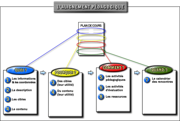
Cette progression imagée sera d’ailleurs utile lors des réunions de parents, afin de leur présenter de façon schématique le cheminement de leur enfant. Vous trouverez un exemple d’infographie de base allant en ce sens sur le site du CEFES de l’Université de Montréal.
Dans le même ordre d’idées, les devoirs de la semaine peuvent être présentés à l’aide d’une infographie-modèle comportant, par exemple, des icônes pour chaque matière. Vous pourriez aussi réaliser un calendrier esthétique qui fournit une vue d’ensemble de tous les travaux à remettre au cours d’une étape. Sinon, en utilisant Thinglink, il est possible de rendre une image cliquable, ce qui mènera les élèves vers les liens nécessaires afin de réviser leurs leçons (vers des pages de vocabulaire, des sections d’Alloprof ou d’autres infographies en ligne, par exemple). Sur cette page du blogue Si c’est pas malheureux!, vous trouverez un tableau créé afin de visualiser les devoirs de la semaine.
Lorsque vous présentez un travail à remettre, vos exigences et consignes pourraient aussi être colligées sur une infographie. Parions ainsi que les élèves s’y conformeront mieux, car ils les retiendront mieux.
Pour évaluer les élèves
En demandant aux élèves de créer des infographies, vous obtenez une production qui, à elle seule, peut constituer une évaluation complète. Comme cette réalisation demande une bonne compréhension de la matière et la capacité de faire des liens entre les contenus, elle permet d’évaluer de manière individualisée.
Évidemment, prévoyez d’abord des évaluations formatives du même type, car la réalisation d’infographies de qualité exige un certain entraînement. Par exemple, après un nombre de périodes X, vous pourriez inviter les jeunes à réaliser une infographie de la matière, et ce, à quelques reprises avant l’examen sommatif. Une autre option peut être de répartir la matière par équipe afin qu’à chaque cours, une équipe devienne responsable de créer une infographie de synthèse, qui sera présentée au début du cours suivant en guise de retour. Cela vous aidera à fournir des rétroactions pertinentes aux élèves quant à leur compréhension et leur assimilation du contenu, en plus de les préparer adéquatement pour une évaluation de type « créez votre infographie ».
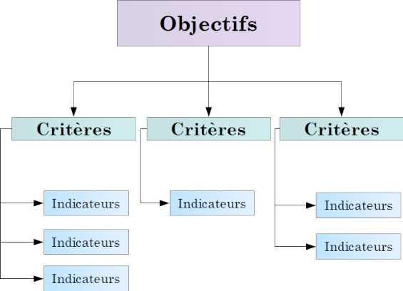
Les infographies schématiques peuvent aussi être utilisées à titre de grille de correction. Dans ce cas, les critères de l’évaluation sont présentés sur une infographie qui comprend des espaces pour noter des éléments observés. Cela s’avère très pratique, entre autres, lors de l’évaluation d’un exposé oral. Vous pouvez ensuite prendre du temps avec l’élève pour effectuer un retour sur chacun des critères, en présentant votre infographie annotée. Sur la page Construire une grille critériée d’évaluation, vous pourrez voir un schéma d’évaluation très simple, avec lequel vous pourriez procéder à vos évaluations en y indiquant vos critères.
L’infographie au service de l’élève
Voici maintenant quelques usages de l’infographie au service de l’élève!
Pour encadrer les travaux
Plus vous présenterez d’infographies, plus vos élèves deviendront aptes à en réaliser. Vous leur transmettrez ainsi une technique qui leur servira toute leur vie et favorisera leur esprit de synthèse. Vous pouvez créer mille et une occasions pour vos jeunes de manipuler la matière à l’aide d’infographies.
De façon simple, tous les travaux de recherche traditionnels peuvent comporter un volet infographique plutôt qu’uniquement du texte. Voyez, par exemple, cette image qui résume les fonctions des deux hémisphères du cerveau : elle pourrait avoir été réalisée par des élèves lors d’une recherche sur ce sujet. Non seulement vous épargnerez du temps pour la correction, puisque ce type de travail se parcourt plus rapidement, mais vous éviterez le plagiat de portions d’articles, puisque l’infographie force en quelque sorte l’usage de mots-clés plutôt que de phrases. Évidemment, vous pouvez aussi combiner les deux méthodes, c’est-à-dire exiger un texte qui sera complété d’une infographie. N’hésitez pas à publier les travaux sur le Web, pour rehausser la motivation de vos troupes.
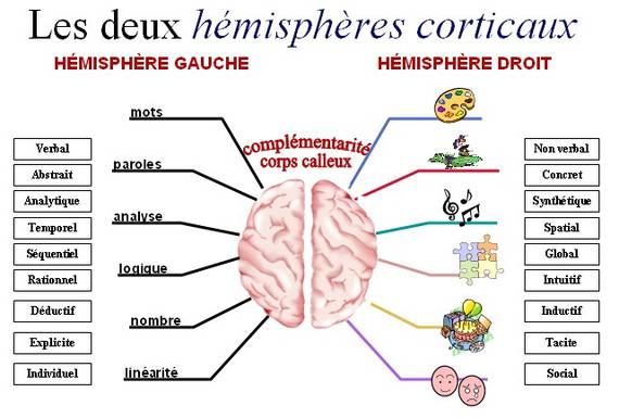
Source : Canopé académie de Besançon
Si les élèves doivent présenter oralement leurs travaux en classe, il s’avère fort pertinent de présenter simultanément l’infographie sur le TNI en guise de support visuel. Ce procédé permet au public de mieux suivre, mais il diminue surtout le stress du présentateur en lui servant de fiche de rappel.
Tel que mentionné précédemment, du temps en classe peut être libéré pour créer des outils de révision et d’étude personnels ou à partager. Cet apprentissage coopératif et créatif favorise des échanges significatifs entre les élèves.
Pour faciliter certaines tâches et apprentissages
Si la majorité des contenus possibles conviennent aux infographies, certaines données répétitives bénéficieront particulièrement de leur création. Les mots de vocabulaire, par exemple, pourraient chaque semaine faire l’objet d’une nouvelle infographie, affichée en classe et partagée sur le Web. En ce sens, l’usage de Wordle s’avère une option. Vous pourrez même déléguer la tâche à des élèves.
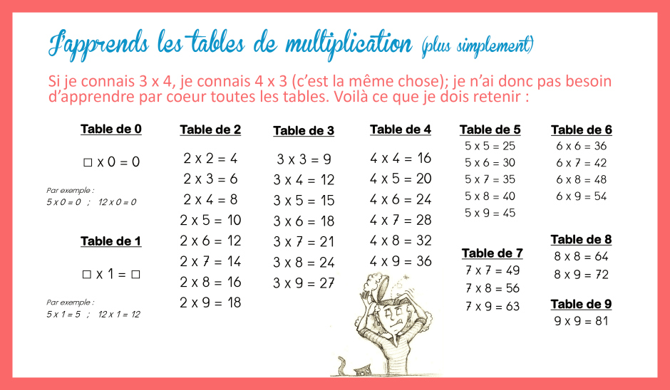
Illustrer les tables d’opérations s’avère aussi un défi stimulant. Comment pourrait-on présenter les tables pour que leur apparence visuelle vienne s’incruster dans le cerveau des jeunes? Lancez leur directement l’idée et voyez ce qu’ils créent! À titre d’exemple, cette infographie propose une version simplifiée des tables de multiplication. Peuvent-ils faire mieux?
Plusieurs règles de grammaire, comme celle des fameux participes passés, pourraient être mieux comprises et retenues si elles étaient présentées de manière visuelle. Constatez-le en observant cette infographie sur le sujet.
Au plan artistique, l’infographie constitue un outil d’expression par excellence. Les élèves pourraient utiliser cette technique pour mettre sur pied leur journal créatif en ligne dans lequel ils couchent leurs sentiments ou leurs rêveries de manière virtuelle.
Il s’agit aussi d’un outil de création hors pair. Par exemple, une infographie pourrait donner vie à un personnage de récit ou même constituer un portrait de soi-même. Vous pourriez poser une question à développement aux enfants (ex. : que feras-tu à trente ans?) et les laisser répondre à l’aide d’une infographie comportant images et courts textes. La présentation de poèmes se marie très bien avec l’infographie et peut s’avérer très simple (comme dans cet exemple). On peut aussi l’envisager pour créer des livres de recettes, des abécédaires, etc. Dans un autre ordre d’idée créatif, les enfants pourraient créer une affiche identifiée à leur prénom à coller sur leur casier ou leur pupitre.
Par ailleurs, au plan organisationnel, l’infographie peut faciliter la création d’affiches promotionnelles à placarder partout dans l’école pour annoncer des activités parascolaires. Cet exemple d’évolution d’un projet, bien que non scolaire, offre un visuel intéressant.
Bref, les possibilités sont immenses. Il suffit de s’amuser à voir comment les informations, les activités et les contenus qui vous entourent peuvent tirer profit de l’image. Lancez-vous dans l’aventure : votre enseignement ne sera plus jamais le même, et c’est tant mieux!